Furnishing ideas
A colourful home: 3 fashionable shades in 2019 for furniture and accessories

Apr
For those who want to surround themselves with colourful furniture without losing sight of style, here are 3 shades to try out with all the tips on how best to match them.
Furnishing your home by carefully choosing the colours of walls, furniture and accessories is by no means simple: it is necessary to balance the shades in order to avoid creating unharmonious combinations; it is necessary to know how to choose the most appropriate combinations according to the furnishing style and also to know how to use the various nuances in such a way as to make each individual corner stand out naturally and never forcedly.
In fact, colour is one of the indispensable decorative elements when choosing home furnishings, which is why it is important to know in advance what to do in order to avoid style mistakes.
Here then 3 trendy shades in this 2019 and tips on how best to combine them, both with other colours and with the most suitable furnishing style.
Furnishing in green

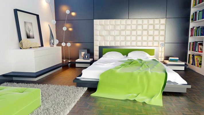
Furnishing in shades of green is one of the best choices when you decide to give your home an atmosphere cool, summery and relaxing. The green is a very versatile colour for furniture and is perfect for both walls and furniture; both for those who opt for a contemporary mood style, with lacquered and super modern furniture, and for those who prefer softer, more romantic lines, perhaps in a shabby chic or Provençal style.
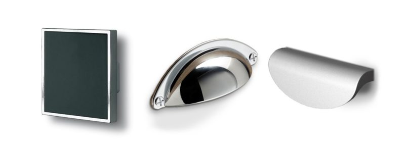
In this house also the complementsobviously have to match the furnishings: the advice is to focus on the combination of green and steelwith handles and knobs and handles with a sophisticated and essential souljust like these signed Polideas:
Green is also a perfect shade for those with a small house why immediately gives a feeling of freshness and, mixed with the white, gives a lot of light to the house, making spaces immediately appear larger.
Green goes well with many other colours: it is perfect with all the various shades of the same nuance, with grey, with light colours such as ivory and dove grey, but also with all shades of brown and, for those who are not afraid of slightly eccentric furnishings, green goes very well with yellow (also ochre), red and purple.
Of course, much depends on the nuances that one chooses: the most suitable ones for furnishing one's home range from apple green to sage, from tiffany to lime green to emerald green, passing through forest green and meadow green. It always depends on personality and personal taste as green, depending on its intensity, can give furnishings many different souls.
Furnishing in midnight blue

The midnight blue is the best colour alternative to black, a passepartout shade loved by those who prefer modern and/or contemporary, linear and basic furniture, very clean in its lines and mood.
Intense and extraordinarily elegant, midnight blue can be dared in a total look or combined with the range of greys, especially pearl grey, and whites to make it brighter.

Midnight blue, as opposed to black, has a much more chic allure and also lends itself very well to ethnic-inspired furnishing styles; combined with light wood, on the other hand, this shade is very reminiscent of the Nordic furniture. In any case, it is a colour that lends itself to different interpretations of style and should always be accompanied by furnishing accessories that give light and personality to the furniture: in this case, the best solution is to focus on the transparency of knobs and handles,

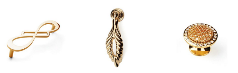
or on jewel complements (such as the Metal line of Polideas) that give even more light, transforming midnight blue furniture into unique and luxurious pieces.

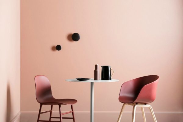
Decorating in powder pink

The powder pink is undoubtedly one of the most glamorous colours of 2019 also for furnishings: it is an extremely chic and elegant shade that lends itself perfectly to furnishings with a romantic and even slightly retro allure. It is an ideal colour not only for the walls of the home, but also for furniture, curtains, cushions and carpets.
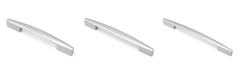
Perfect when combined with wooden accessories, such as the Wood handle,

will take on a very refined air with the steel knobs and handles, which also give the furniture an extra touch of personality.
Being a very chic and understated colour, the powder pink goes well with many other colours, especially those in the white range, but it also goes very well with beige, grey and all shades of pink, from baby to fuchsia, to create striking mixes.
Who loves the luxurious furnishings instead, will love the combination of powder pink and the gold-coloured complements of the Metal line, while fans of shabby chic will find their ideal match in the complements of the Anticati line.

With these 3 shades and our tips, your home will be decorated in the right colours and the result will be beautiful and harmonious.
Moreover, if you subscribe to the Polideas newsletter, you will get 10% discount on the purchase of our complements and lots of news, month by month, to make your home even more beautiful.